Jessica Chapman
Support
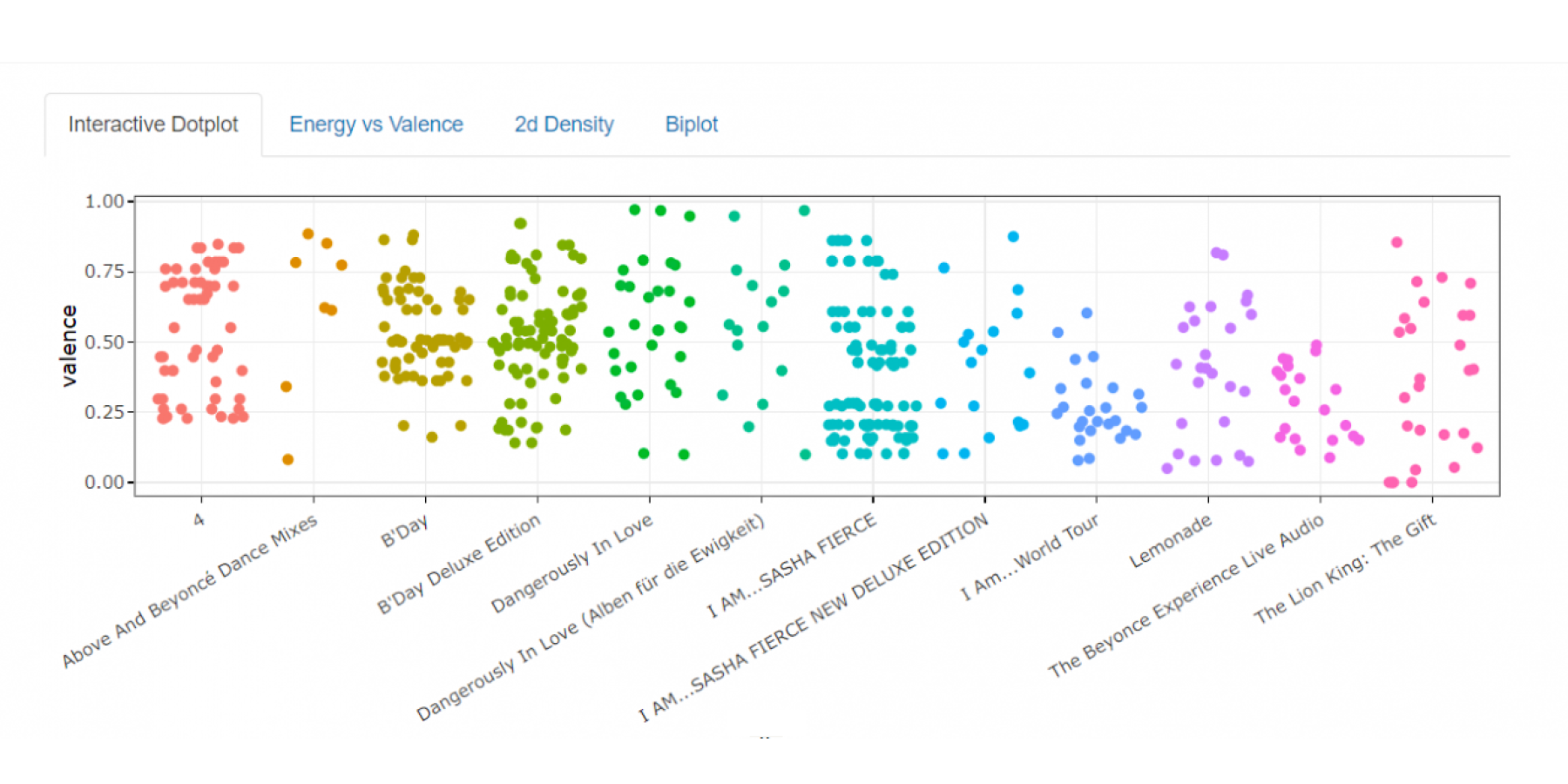
The end result of this project is a Shiny web app which generates four different visualizations of musical data. The data source is the Spotify API, which is easily accessible and provides data for many different artists. The Shiny app allows the user to type in whichever artist they want. First, they will see a simple interactive dotplot of the valence of an artist’s body of work. Valence, a variable used in all of the plots, is a measure of musical turbulence, which allows the user to interpret if a song sounds stable or unstable. The next graph shows an interactive scatterplot of valence and energy. This plot groups the songs into four emotional categories, happy, chill, angry and sad. The next plot simply groups this scatterplot by album, which allows the user to see how an artist’s sound may have changed over time. Finally, there is a biplot. This plot uses a principal components analysis to incorporate nine different variables into the analysis, however, it is included to show how easy it is to make graphs which are impossible to interpret and not useful to those outside of the statistics field.

